Create a Dark Mode Toggle for Your Website
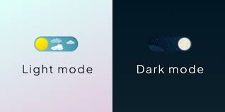
Give your users control over their viewing experience with a dark mode toggle. Dark mode not only reduces eye strain in low-light environments but has become an expected feature for modern websites. This tutorial will guide you through implementing a fully functional dark mode toggle with clean design, smooth transitions, and persistent settings.
Why Implement Dark Mode?
- Reduce eye strain in low-light environments
- Decrease battery consumption on OLED/AMOLED screens
- Improve accessibility for users with light sensitivity
- Follow modern design trends and user expectations
- Enhance user experience by providing customization options
Getting Started
Before diving into the code, let’s understand what we need:
- A toggle mechanism (button or switch)
- CSS variables for light and dark themes
- JavaScript to handle the toggle functionality
- Local storage integration to remember user preference
HTML Structure
First, let’s create the toggle button:
<button id="darkModeToggle" aria-label="Toggle dark mode">
  <svg class="sun-icon" viewBox="0 0 24 24" width="24" height="24">
    <path d="M12 17c-2.76 0-5-2.24-5-5s2.24-5 5-5 5 2.24 5 5-2.24 5-5 5zm0-8c-1.65 0-3 1.35-3 3s1.35 3 3 3 3-1.35 3-3-1.35-3-3-3zm0-2V4m0 16v-3m8-8h-3m-10 0H4m14.66 6.66l-2.12-2.12M7.46 7.46L5.34 5.34m12.32.01l-2.12 2.12M7.46 16.54l-2.12 2.12" stroke="currentColor" stroke-width="2" stroke-linecap="round" />
  </svg>
  <svg class="moon-icon" viewBox="0 0 24 24" width="24" height="24">
    <path d="M12 3a9 9 0 1 0 9 9c0-.46-.04-.92-.1-1.36a5.5 5.5 0 0 1-4.9-8.54c-1.24-.21-2.53-.1-3.72.34" fill="none" stroke="currentColor" stroke-width="2" stroke-linecap="round" />
  </svg>
</button>
CSS Setup with Variables
Create a foundation with CSS variables that will change based on the theme:
:root {
  /* Light theme (default) */
  --background-primary: #ffffff;
  --background-secondary: #f5f5f5;
  --text-primary: #333333;
  --text-secondary: #666666;
  --accent-color: #4a6cf7;
  --border-color: #e0e0e0;
  --card-bg: #ffffff;
  --card-shadow: 0 2px 8px rgba(0, 0, 0, 0.1);

  /* Transition for smooth theme switching */
  --transition-speed: 0.3s;
}

[data-theme="dark"] {
  /* Dark theme */
  --background-primary: #121212;
  --background-secondary: #1e1e1e;
  --text-primary: #e0e0e0;
  --text-secondary: #b0b0b0;
  --accent-color: #6d8aff;
  --border-color: #404040;
  --card-bg: #1e1e1e;
  --card-shadow: 0 2px 8px rgba(0, 0, 0, 0.4);
}

/* Apply variables to elements */
body {
  background-color: var(--background-primary);
  color: var(--text-primary);
  transition: background-color var(--transition-speed),
              color var(--transition-speed);
}

h1, h2, h3, h4, h5, h6 {
  color: var(--text-primary);
}

p, li, span, label, input, textarea {
  color: var(--text-secondary);
}

a {
  color: var(--accent-color);
}

.card {
  background-color: var(--card-bg);
  border: 1px solid var(--border-color);
  box-shadow: var(--card-shadow);
}

/* Toggle button styling */
#darkModeToggle {
  background: transparent;
  border: none;
  cursor: pointer;
  width: 40px;
  height: 40px;
  display: flex;
  align-items: center;
  justify-content: center;
  color: var(--text-primary);
  border-radius: 50%;
  transition: background-color 0.2s;
}

#darkModeToggle:hover {
  background-color: var(--background-secondary);
}

/* Handle icon visibility */
.sun-icon {
  display: none;
}

.moon-icon {
  display: block;
}

[data-theme="dark"] .sun-icon {
  display: block;
}

[data-theme="dark"] .moon-icon {
  display: none;
}
JavaScript Implementation
Now let’s implement the toggle functionality:
// Wait for DOM to load completely
document.addEventListener('DOMContentLoaded', () => {
  const toggleButton = document.getElementById('darkModeToggle');

  // Check for saved theme preference or use OS preference
  const savedTheme = localStorage.getItem('theme');
  const prefersDarkMode = window.matchMedia('(prefers-color-scheme: dark)').matches;

  // Set initial theme
  if (savedTheme === 'dark' || (!savedTheme && prefersDarkMode)) {
    document.documentElement.setAttribute('data-theme', 'dark');
  }

  // Toggle theme when button is clicked
  toggleButton.addEventListener('click', () => {
    const currentTheme = document.documentElement.getAttribute('data-theme');
    const newTheme = currentTheme === 'dark' ? 'light' : 'dark';

    // Update theme attribute
    document.documentElement.setAttribute('data-theme', newTheme);

    // Store preference
    localStorage.setItem('theme', newTheme);

    // Announce theme change to screen readers
    const message = `Switched to ${newTheme} mode`;
    announceThemeChange(message);
  });

  // Function to announce theme change for screen readers
  function announceThemeChange(message) {
    const announcement = document.createElement('div');
    announcement.setAttribute('aria-live', 'polite');
    announcement.setAttribute('class', 'sr-only');
    announcement.textContent = message;
    document.body.appendChild(announcement);

    // Remove after announcement is made
    setTimeout(() => {
      document.body.removeChild(announcement);
    }, 1000);
  }

  // Listen for OS theme changes
  window.matchMedia('(prefers-color-scheme: dark)').addEventListener('change', (e) => {
    // Only change theme if user hasn't manually set preference
    if (!localStorage.getItem('theme')) {
      const newTheme = e.matches ? 'dark' : 'light';
      document.documentElement.setAttribute('data-theme', newTheme);
    }
  });
});
Advanced Features
Animation for Smooth Transitions
Add this to your CSS for a smoother experience:
/* Add subtle transition to all elements */
* {
  transition: background-color var(--transition-speed),
              color var(--transition-speed),
              border-color var(--transition-speed),
              box-shadow var(--transition-speed);
}

/* Toggle button animation */
@keyframes rotate {
  from { transform: rotate(0deg); }
  to { transform: rotate(360deg); }
}

#darkModeToggle svg {
  transition: all 0.3s ease;
}

#darkModeToggle:active svg {
  animation: rotate 0.5s ease;
}
Prevent Flash of Incorrect Theme
Add this script to the <head> of your HTML to prevent the flash of incorrect theme on page load:
<script>
  // Immediately set theme before page renders
  (function() {
    const savedTheme = localStorage.getItem('theme');
    const prefersDarkMode = window.matchMedia('(prefers-color-scheme: dark)').matches;

    if (savedTheme === 'dark' || (!savedTheme && prefersDarkMode)) {
      document.documentElement.setAttribute('data-theme', 'dark');
    }
  })();
</script>
Integration with Popular Frameworks
React Example
import { useState, useEffect } from 'react';

function DarkModeToggle() {
  const [isDarkMode, setIsDarkMode] = useState(() => {
    const savedTheme = localStorage.getItem('theme');
    const prefersDarkMode = window.matchMedia('(prefers-color-scheme: dark)').matches;
    return savedTheme === 'dark' || (!savedTheme && prefersDarkMode);
  });

  useEffect(() => {
    if (isDarkMode) {
      document.documentElement.setAttribute('data-theme', 'dark');
      localStorage.setItem('theme', 'dark');
    } else {
      document.documentElement.setAttribute('data-theme', 'light');
      localStorage.setItem('theme', 'light');
    }
  }, [isDarkMode]);

  return (
    <button
      onClick={() => setIsDarkMode(!isDarkMode)}
      aria-label={`Switch to ${isDarkMode ? 'light' : 'dark'} mode`}
      className="dark-mode-toggle"
    >
      {isDarkMode ? (
        <svg className="sun-icon" viewBox="0 0 24 24" width="24" height="24">
          {/* Sun icon path */}
        </svg>
      ) : (
        <svg className="moon-icon" viewBox="0 0 24 24" width="24" height="24">
          {/* Moon icon path */}
        </svg>
      )}
    </button>
  );
}

export default DarkModeToggle;
Vue Example
<template>
  <button
    @click="toggleDarkMode"
    :aria-label="`Switch to ${isDarkMode ? 'light' : 'dark'} mode`"
    class="dark-mode-toggle"
  >
    <svg v-if="isDarkMode" class="sun-icon" viewBox="0 0 24 24" width="24" height="24">
      <!-- Sun icon path -->
    </svg>
    <svg v-else class="moon-icon" viewBox="0 0 24 24" width="24" height="24">
      <!-- Moon icon path -->
    </svg>
  </button>
</template>

<script>
export default {
  data() {
    return {
      isDarkMode: false
    }
  },
  created() {
    const savedTheme = localStorage.getItem('theme');
    const prefersDarkMode = window.matchMedia('(prefers-color-scheme: dark)').matches;
    this.isDarkMode = savedTheme === 'dark' || (!savedTheme && prefersDarkMode);
    this.applyTheme();
  },
  methods: {
    toggleDarkMode() {
      this.isDarkMode = !this.isDarkMode;
      this.applyTheme();
    },
    applyTheme() {
      if (this.isDarkMode) {
        document.documentElement.setAttribute('data-theme', 'dark');
        localStorage.setItem('theme', 'dark');
      } else {
        document.documentElement.setAttribute('data-theme', 'light');
        localStorage.setItem('theme', 'light');
      }
    }
  }
}
</script>
Common Design Patterns
Positioned in Navigation Bar
<nav class="main-nav">
  <div class="logo">Site Name</div>
  <ul class="nav-links">
    <li><a href="/">Home</a></li>
    <li><a href="/about">About</a></li>
    <li><a href="/contact">Contact</a></li>
  </ul>
  <button id="darkModeToggle" aria-label="Toggle dark mode">
    <!-- Icons here -->
  </button>
</nav>
As Part of User Settings Menu
<div class="user-settings">
  <h3>Display Settings</h3>
  <div class="setting-item">
    <label for="darkModeToggle">Dark Mode</label>
    <div class="toggle-switch">
      <input type="checkbox" id="darkModeToggle" />
      <span class="toggle-slider"></span>
    </div>
  </div>
</div>
Testing Your Implementation
Ensure your dark mode works correctly by testing:
- Initial load based on user preferences
- Toggle functionality
- Persistence across page reloads
- Proper transition animations
- Check accessibility with screen readers
- Test across different browsers and devices
Accessibility Considerations
- Ensure toggle has proper
aria-labelthat updates with state - Maintain sufficient contrast ratios in both themes
- Announce theme changes to screen readers
- Ensure focus states are visible in both themes
Common Issues and Solutions
Issue: Flash of incorrect theme on page load
Solution: Use the preload script technique shown earlier to apply theme before page renders.
Issue: Some elements don’t change with the theme
Solution: Ensure all color values use CSS variables instead of hardcoded values.
Issue: Animations feel jarring
Solution: Adjust the transition duration (–transition-speed) to a more comfortable value.
Issue: Theme doesn’t persist across pages
Solution: Make sure localStorage is being read on each page load.
Final Touches
To ensure your dark mode implementation is professional and well-received, consider these final touches:
- Add subtle transition effects when switching themes
- Ensure all UI elements adapt appropriately
- Test with users to get feedback on the experience
- Consider adding a system preference option (auto mode)
- Include visual indicators to clearly show current theme state
Conclusion
Implementing a dark mode toggle is more than just swapping colors—it’s about enhancing user experience and accessibility. By following this guide, you’ve created a robust, user-friendly dark mode implementation that respects user preferences and works seamlessly across your website.
A well-implemented dark mode can significantly improve user satisfaction and distinguish your website as one that cares about user experience. As an added bonus, your users’ eyes will thank you for those late-night browsing sessions!
Have you implemented dark mode on your website? Share your experience in the comments below!